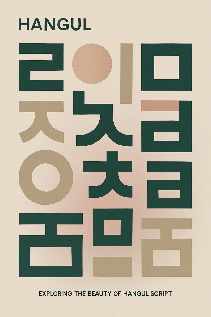
Typography Pairing for Posters: How to Mix Fonts Like a Pro
Typography is more than just picking a font. It’s about telling a story with letters. When you’re designing a poster, your font choices can either scream “look at me!” or whisper “meh…”. That’s where smart typography pairing for posters steps in.
Whether you’re working on a music event poster, a product launch, or a motivational quote for Instagram—knowing which fonts to mix (and which to avoid like Comic Sans in 2025) is what separates amateurs from the design elite. 😎
Let’s dig into how to pair fonts like a design sorcerer—with style, clarity, and intention.
Why Typography Pairing Matters in Poster Design
Fonts carry emotion. Just like colors or imagery, typography sets the mood of your poster. Pairing two fonts correctly can create contrast, hierarchy, and visual rhythm. But pairing fonts wrong? Yikes. It can look messy, confusing, or like your Canva account exploded.
With strong typography pairing for posters, you’ll:
- Improve readability
- Create visual interest
- Guide your viewer’s eye
- Reinforce your design message
The Golden Rule of Typography Pairing for Posters
Contrast + Harmony = Magic.
You want fonts that contrast enough to stand apart, but still harmonize like a well-rehearsed duet. Think:
- Serif + sans serif
- Bold + light
- Decorative + clean
- Script + uppercase
But don’t go wild—limit yourself to 2 fonts max per poster (3 if you’re feeling spicy and know what you’re doing).
Best Font Pairings for Poster Design
Here are some top-tier combos that never miss:
1. Montserrat Bold + Open Sans Regular
Vibe: Modern, clean, easy to read
Great for event posters, tech ads, or anything minimal.
2. Playfair Display + Lato
Vibe: Elegant but approachable
Perfect for fashion promos, editorial posters, or portfolios.
3. Bebas Neue + Roboto
Vibe: Bold and commanding
Use it for sports, music fests, or anything high energy. The Bebas grabs attention, Roboto keeps it grounded.
4. Raleway + PT Serif
Vibe: Soft modernism
For art shows, lifestyle brands, or wellness posters. This combo feels balanced and calming.
5. Abril Fatface + Work Sans
Vibe: Statement meets simplicity
Fatface delivers the drama, Work Sans handles the fine print. Use it for sales posters or quote-based designs.
How to Create Typographic Hierarchy
Even with the right fonts, your poster can fall flat if there’s no visual flow. Here’s how to build a strong hierarchy:
- Main Header (H1): Big, bold, and bossy.
- Subheader (H2): Medium-size, supports the headline.
- Body Text (H3 or paragraph): Smallest, clean and easy to skim.
Use size, weight, and spacing to make each layer feel distinct—but connected.
Tips for Typography Pairing That Works Every Time
Here’s your cheat sheet for font success:
- Stick to two font families. One for headlines, one for body.
- Avoid pairing two fonts that are too similar. No twins—think opposites that vibe.
- Check readability from a distance. If your poster’s seen on a wall, street, or feed—make sure it reads well at a glance.
- Use letter spacing (tracking) and line height (leading) for breathing room. Especially on larger blocks of text.
- Use uppercase carefully. It screams—in a good or bad way.
Typography Mistakes to Avoid
Okay but real talk—don’t let these common mistakes steal your poster’s spotlight:
- Using more than three fonts (aka chaos in a file)
- Pairing decorative fonts together (too much flair, not enough clarity)
- Ignoring line spacing (hello, eye strain)
- Making everything bold (if everything’s loud, nothing’s heard)
Poster Typography in Different Styles
Let’s match font combos to poster vibes:
- Retro Poster: Try Cooper Black + Futura Light
- Minimalist Poster: Try Helvetica Neue + Georgia
- Luxury Poster: Try Cinzel + Source Sans Pro
- Grunge/Street Style Poster: Try Impact + Courier New
- Cute/Kawaii Poster: Try Fredoka + Quicksand
Free Tools to Test Typography Pairing for Posters
Before you commit, test your font pairings like a pro:
- Fontpair.co – Pairs Google Fonts that look amazing together
- Typ.io – See real website font combos
- Canva Font Pairing Tool – Perfect for quick mockups
- Adobe Fonts Pairing Guide – Curated pairings for premium users
Bonus tip: Screenshot your poster → squint at it → if you still get the vibe, you’re on the right track. 👀
Final Thoughts: Typography Is Your Poster’s Voice
The fonts you choose speak—loudly, clearly, emotionally. Whether it’s shouting “sale!” or whispering “gallery opening,” smart typography pairing for posters can elevate your design from basic to boss.
So next time you’re designing a poster, remember: the right font combo isn’t just aesthetic—it’s storytelling. Choose wisely, pair boldly, and let your letters dance.
Bonus Call-to-Action:
Need help finding your poster’s perfect font soulmates? Hit up ocravio.online or drop a DM on Insta—we’ll turn your words into art.
